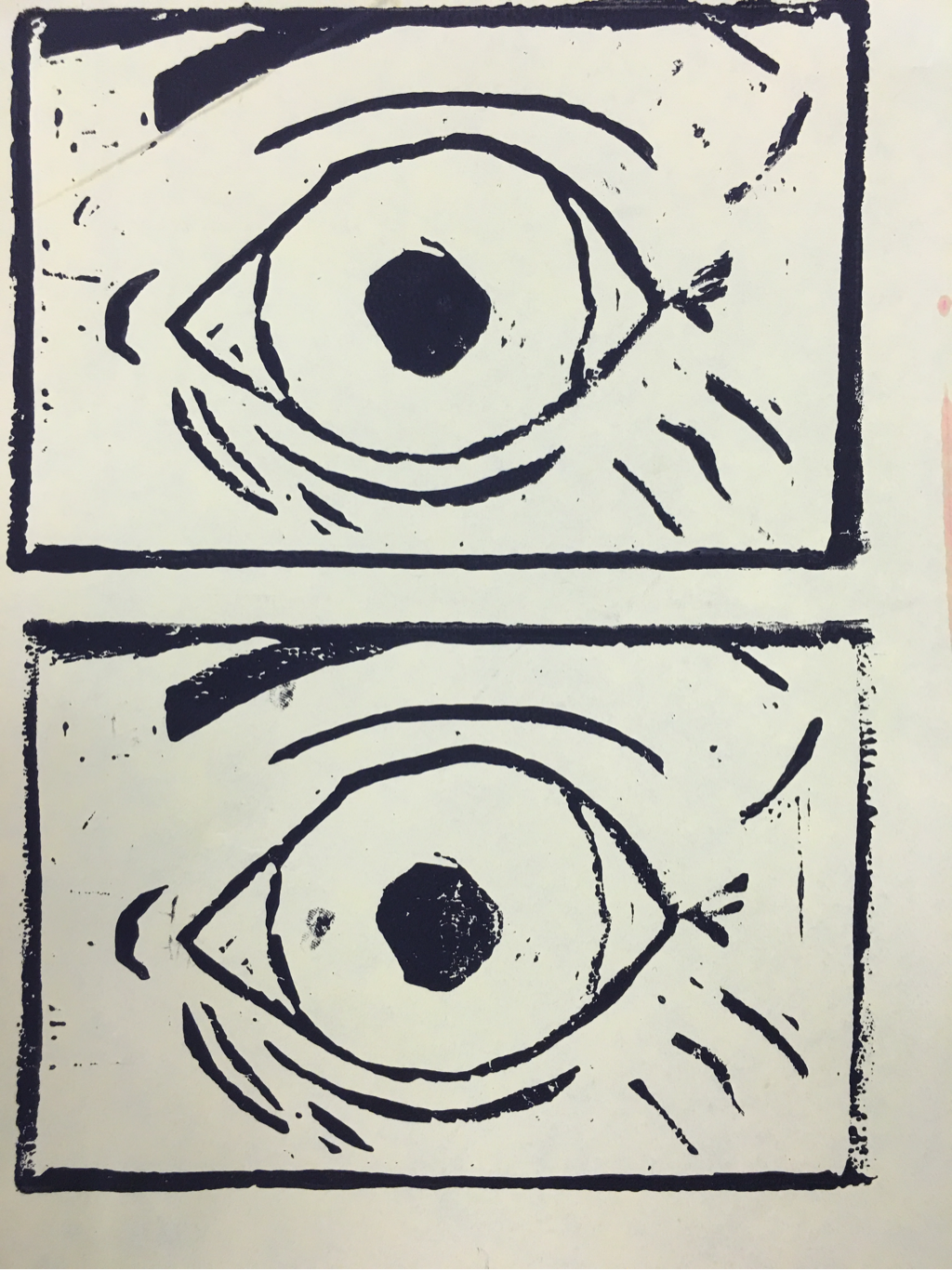
this was made with a carved block and ink. The color creates a lot of contrast between the actual features and the paper. There's also space within the eye. The work has a scary feeling.
|
this was made with a carved block and ink. The color creates a lot of contrast between the actual features and the paper. There's also space within the eye. The work has a scary feeling.
0 Comments
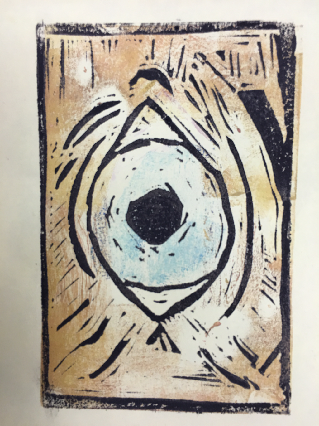 this was a print done with ink and a carved block. I used color to create contrast between the skin and the iris. The skin also has texture. The cut-off eyebrows help create proportion. The work has a creepy feel because it's so close up.
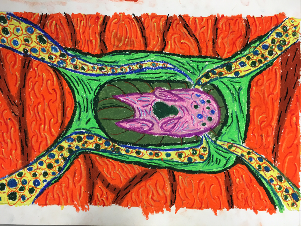 this was made with oil pastels on paper. The color creates contrast between the background and the foreground. The curvy shapes contribute to a jazzy feel. The pattern in the background creates a sens of movement, and the centered composition put emphasis on the figure in the middle
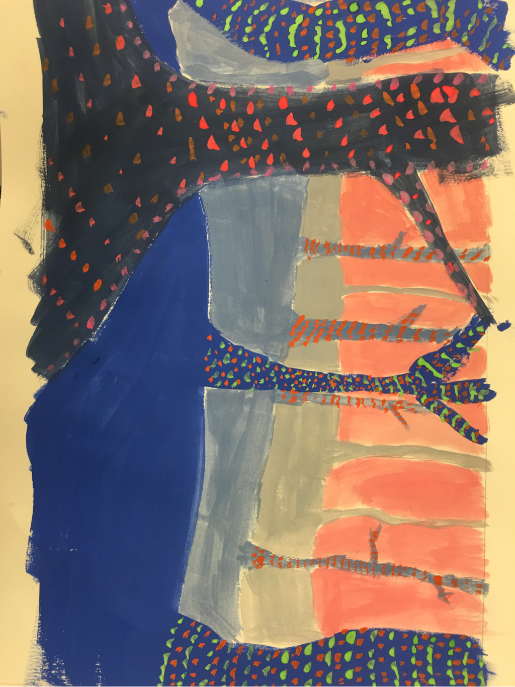 this painting was made with watercolor on paper. I used color to create depth and value to create perspective there are patterns in the dots, and the large tree contributes to the proportion. Overall it has a spooky feel.
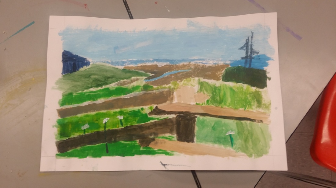 This picture was made with paper and pencil and acrylic paint. It was my first time using acrylic paint, which was difficult because it dries very oddly. The picture used line and value to create depth and pattern. It reminds me of being on the beach.
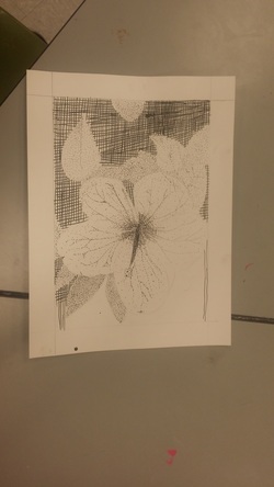 This image is a hibiscus flower with a leafy background, made with pen and ink on paper. This was my first time using pen and ink and with it I learned how to make texture and value using methods like stippling and cross hatching. I used lines, the create patters like the crosses, and dots to create shape and value. By using sharp contrast in the value, the image has a dramatic look.
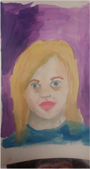 This was made from pencil, paper, and watercolor a paint. I had to use a lot of shading and color dropping with the water colors to create depth and value. The shading also created contrast between the higlights and lowlights on my face.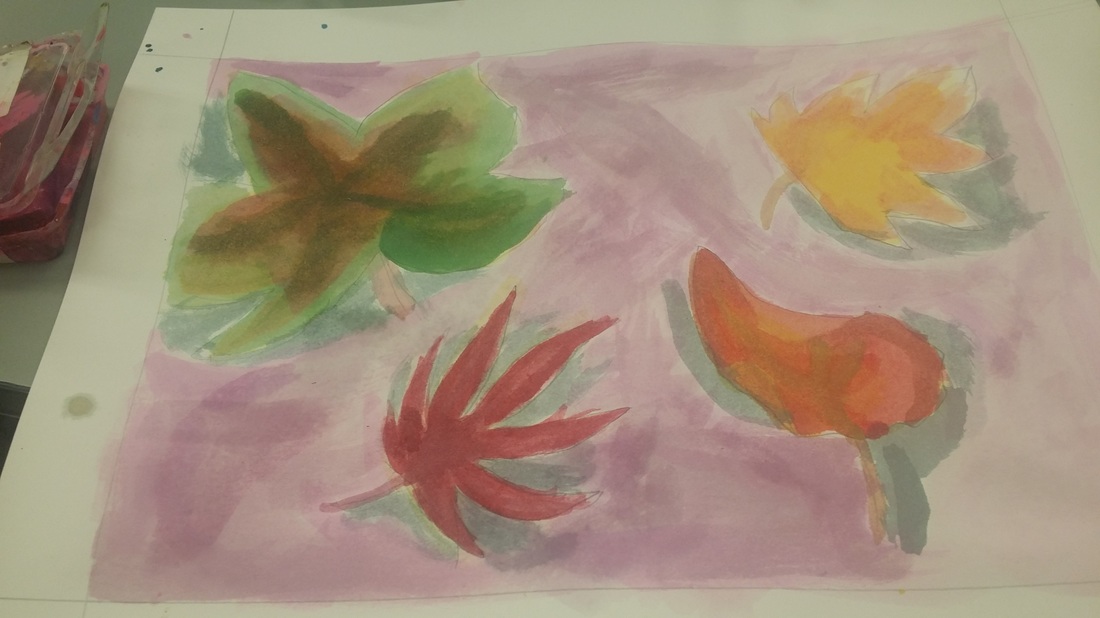 This work is watercolor and pencil on paper. I started by making each leaf yellow and then dropping color into the leaf to enhance shade and made the coloring more realistic, considering space and dimension. Value was used to create space, the leaves had a very loose shape, most of the space was occupied by leaves, the rest by background, and mostly warm colors were used to fit the fall theme. The leaves were bent and flowing to create an illusion of movement, shadowing created both depth and and emphasis by allowing the leaves to be the brightest part of the page. The leaves moved together, seemingly, to create harmony.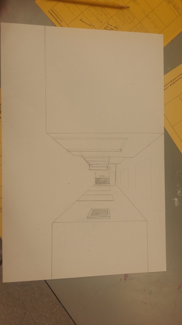 This drawing is pencil on paper. I used a ruler and a vanishing point as a basis for creating depth in the space. Line is used to create depth and space by slanting away form the vanishing point. Lots of square shapes were used to create an industrial feeling. By creating larger spaces between closer objects than farther objects, perspective was added. The contrast between the openness of the foreground and the cluttered of the background made the end of the hallway seem farther away. In that way, proportion is also used to make scale. The drawing has a particularly clinical feeling to it.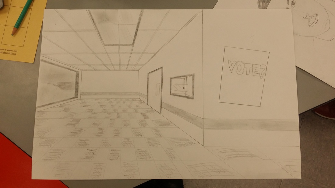 This is pencil on paper. I used a ruler to create lines form a vanishing point. This created an illusion of depth and space, placing the end of the hall farther away than the poster, despite being actually side by side on the page. I used the direction of lines on the floor to make the tiles lay flat. I used value to make the closer wall seem nearer than the farther wall by making the lines around it darker than the lines around the far wall. I used small dots on the ceiling to create texture on the paneling. The vanishing point and the lines leading to it create a sense of movement by drawing the eye to the central point. The tiles and ceiling paneling are both made of simple patterns. I used proportion in making closer object bigger, adding perspective to the drawing. Overall, the drawing has sort of a spooky feeling, enhancing by the stormy background.
|
AuthorHow Archives
December 2015
Categories |
 RSS Feed
