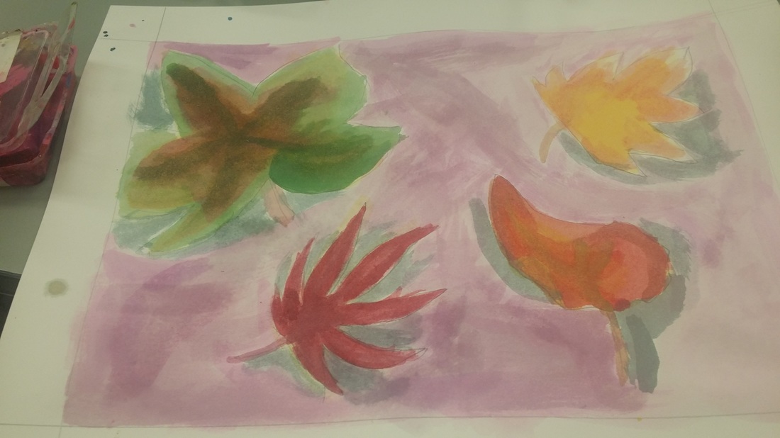
 This work is watercolor and pencil on paper. I started by making each leaf yellow and then dropping color into the leaf to enhance shade and made the coloring more realistic, considering space and dimension. Value was used to create space, the leaves had a very loose shape, most of the space was occupied by leaves, the rest by background, and mostly warm colors were used to fit the fall theme. The leaves were bent and flowing to create an illusion of movement, shadowing created both depth and and emphasis by allowing the leaves to be the brightest part of the page. The leaves moved together, seemingly, to create harmony.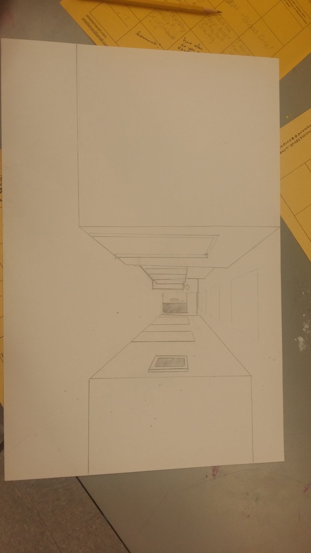 This drawing is pencil on paper. I used a ruler and a vanishing point as a basis for creating depth in the space. Line is used to create depth and space by slanting away form the vanishing point. Lots of square shapes were used to create an industrial feeling. By creating larger spaces between closer objects than farther objects, perspective was added. The contrast between the openness of the foreground and the cluttered of the background made the end of the hallway seem farther away. In that way, proportion is also used to make scale. The drawing has a particularly clinical feeling to it. |
AuthorHow Archives
December 2015
Categories |
 RSS Feed
